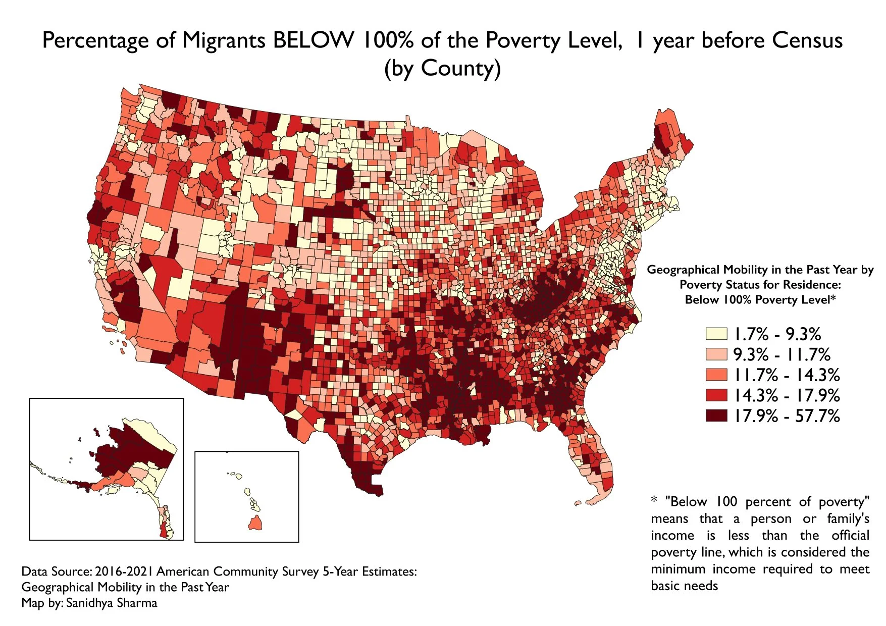
For this assignment, I explored cartographic principles and thematic mapping by visualizing the percentage of migrants below 100% of the poverty level across the United States. Using the WRI Global Power Plant dataset structure as a guide, I symbolized the data proportionally by poverty rate and categorically by migration status. The final map featured a dual symbology approach, highlighting geographic variation in poverty among migrant populations. Additional map elements included a scale bar, inset map, and legend designed in QGIS, emphasizing both spatial accuracy and visual clarity in the representation of socioeconomic vulnerability at the county level.